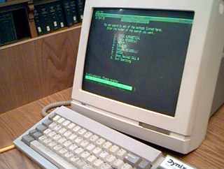
Futuristic computer interfaces are usually depicted with cyan text, and retro computer terminals with green or yellow text. Has this always been the case? Or is this simply a case of inertia?
Interestingly, these cyan computer interfaces seem to generally appear monochromatic, whereas most interfaces that we use today have multiple colors to highlight areas of interest. In a strange way, these "futuristic" interfaces have more in common with computers before the point-and-click era. This is true of crime shows with tech nerds helping agents in the field, and sci-fi shows set far in the future.
Maybe this is just a coincidence. But, it seems like our artistic depictions of these futuristic interfaces are drawing heavily on the past because they're less familiar to people now or because we haven't updated what we think the future looks like (e.g., Tomorrowland).
