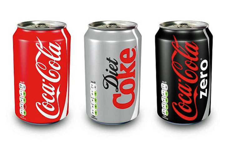
On vertical banners, text can be rendered so that letters are stacked on top of one another, read from top to bottom. But other times the text as a whole needs to be rotated so that it'll fit the canvas. At first, I thought that text is always rotated so that it can be read from top to bottom, but in practice it seems like it's just as common for it to be read from bottom to top.

It's interesting that there isn't a standard way to orient text in this kind of situation. When hanging an American flag, the blue is supposed to be on the left. I would have expected it to be standard for the baseline of the text to run along the edge of the wall or pole that a banner is being hung from.